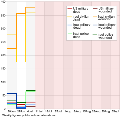
The BBC is monitoring the US-led ‘surge’ in Iraq , offering various indicators of its success or failure including body counts, levels of electricity provision and Iraqi hospitals’ intake of victims. In the report, the body count comes first, including a neat little graph. But, at the risk of sounding callous, is this body count necessarily the primary indicator of the ‘success’ of these military operations? Is a graph a useful way to think about this situation? The BBC does not include in its report what the military’s stated aims and objectives might be. By imposing their own benchmark, the BBC runs the risk of resentment from US or UK militaries, further weakening trust between journalists and military forces.